
2025 Trends in Commercial Space Decorative Film Colors and Combinations
The international popular colors for commercial space decorative films in 2025 mainly include the following:
* Dark blue tones: Deep sapphire blue, combining modern design with retro luxury, suitable for minimalist styles or scenes that require emphasizing spatial hierarchy;
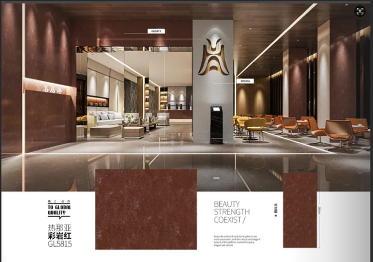
* Ruby tones: Rich ruby color with a brown base, suitable for creating personalized spaces, especially for commercial display areas or areas that need to highlight visual impact;
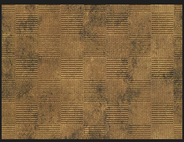
* Caramel red: Deep red, with mahogany and deep purple bases, suitable for creating a high-end commercial atmosphere, commonly seen in high-end commercial space designs;
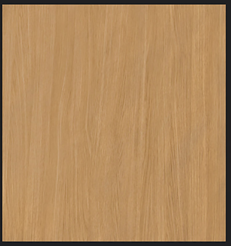
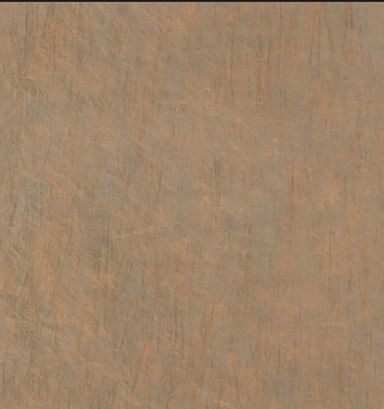
* Warm neutral colors: Caramelized tones that blend reddish-brown with modernity, suitable for creating a nostalgic commercial environment.
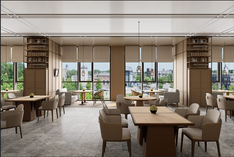
According to the 2025 trend, the combination of PVC/PET/PP decorative films can be based on warm and rustic earth tones and low-saturation natural inspiration colors, while combining classic color schemes to create personalized spaces.
1. Similar color scheme combination: Select different shades of the same color for gradient combinations, such as from light to dark brown, which can create a clear hierarchy effect and appear elegant and soothing;
2. Classic contrasting colors: Try the collision of cool and warm tones, such as blue-brown combination (chocolate brown coat paired with twilight blue inner layer), can balance the heaviness and lightness of autumn, and add elegance;
3. Highlighting bright colors: In the overall low-saturation base tone, add a small amount of bright color (such as amber orange, pine needle green) as an intersperse, can brighten the space and avoid dullness.
Decorative Film’s Practical Color Matching Tips:
1. Balance Warm and Cool: Pay attention to the emotional balance brought by the colors to the audience. Avoid being too cold or too hot. Neutral colors (such as white, gray, and beige) are excellent harmonizers;
2. Analogous Colors and Contrasting Colors: Analogous color combinations (such as colors with a 30-degree or 60-degree hue) are harmonious and natural. While contrasting colors (such as complementary colors) can create a strong visual impact, it is necessary to pay attention to the proportion of the main and secondary elements to avoid an equal distribution;
3. Materials and Textures: Combining different materials (such as silk, linen, metal) and textures (such as floral patterns, watercolor effects) can enhance the richness and sophistication of the colors.
After several months of meticulous refinement, Future Colors has also developed its own series of popular color combinations for commercial space PVC/PET/PP decorative films, providing consumers with a unique texture experience and visual impact.
Send Inquiry


X
We use cookies to offer you a better browsing experience, analyze site traffic and personalize content. By using this site, you agree to our use of cookies.
Privacy Policy